Imagining a universe
of frontier thinkers
Atria University is a newly launched, one of the few liberal Sciences undergrad universities based in India. It professes learning by doing with a great deal of emphasis on team work and industry internships. The courses offered are referred to as Majors which are a well thought out blend of STEM and Liberal Arts.
Problem Statement
The brand of Atria University though unique and one of a kind doesn't reflect in the communication and visual design. The visual language was borderline dated and all over the place with no focus.
Solution
Creating the essence of the brand in tangible and visual terms bridging the gap between what the institution seeks to stand for and what comes across in their communication. Aligning the brand midway, within weeks, to a strategic change in messaging.
Client Name
Design Team
Dwarka Nath Sinha
Branding
Communication Design
Social Media
Publication Design
Web Design
The existing communication material had a busy visual design and lacked good information hierarchy. On the brand front the aesthetics were slightly outdated and haphazard.
Old Design Language
Incremental changes were introduced to the visual design, cleaning up unnecessary visual elements, focusing on the content, bringing in motion design, building information hierarchy, contextualising the characters to the Indian students and contemporising the design language without breaking the existing visual associations.
The university went through a brand refresh in terms of the vision, mission and brand positioning. The refresh was done by Done & Partners. We had the task to visualise the vision into what the brand would look like while conveying the renewed brand promise.
The new brand was positioned as "Asia's first beyonding university" and the university was endeavouring to create beyonders who would be ready for a world of jobs that don't yet exist. One of the key inspirations was science fiction with the four pillars of frontier thinking, contagiously optimistic, doing what's right and relentless.
The design and the marketing team brainstormed on the visual ques from the new brand positioning and arrived at the following which was presented to all the stakeholders within the university team.
The third visual with the space-like feel was approved and based on that designs were create for different communication requirements for the different departments.
Since this refresh happened in between an ongoing admission cycle the team had to continue producing creatives and evolve the visual language along the way.
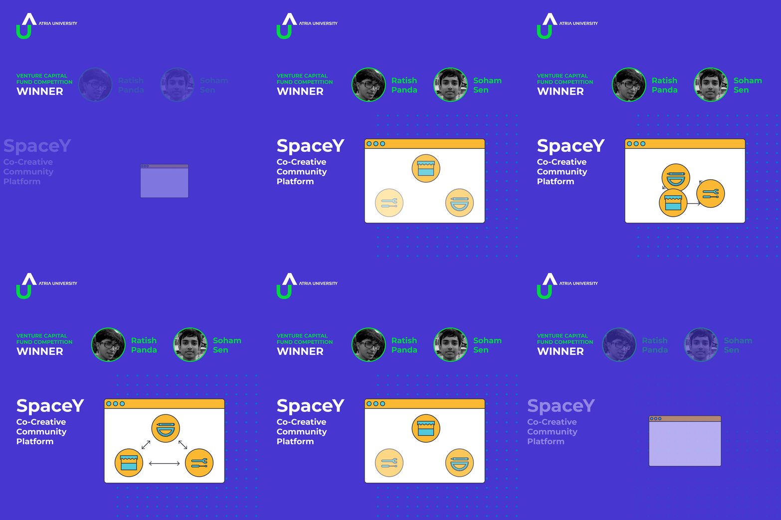
Social Media Creatives/Advertisements
The videos in this section were all made using the Apple's Keynote software as there was no time to commission an expert animator.
Website and other banners
Brochure and Print Advertisement
Display Iconography
Given that the new visual language was borrowing heavily from space and the celestial bodies the icons developed to denote different aspects of the University's messages were drawn in a circular form. All illustrations were also given rounded edges. These are not UI icons.
The work also involved designing landing pages for social media advertisements which were made using a webpage builder tool provided by the CRM vendor.
Throughout the process the attempt was to create a unified visual brand language that can create a strong brand association and recall along with content that can excite the target audience.


